HealthPowr
Designing the product infrastructure for a social impact platform connecting underserved NYC communities to the services that already exist for them.
There wasn't a spec, just a founder with a mission, a developer mid-build on a live Next.js and Supabase codebase, and a platform that needed to be ready for its first pilot in three weeks. What the platform needed to be — the surfaces, the flows, the permission model, the information architecture across four distinct user types — was largely unresolved. That was my job to figure out.
The product: a free platform connecting underserved New York City communities to housing, healthcare, food, employment, and mental health resources through verified community-based organizations. The scope: a public landing page, a client portal and discovery flow, a CBO admin portal, a caseworker portal, and a platform admin system.
I was the sole designer.



Rethinking the Landing Page Flow
The original flow was conventional: land, create account, find services, submit request. The account wall was first.
I moved it last.
The reasoning was about confidence. A community member arriving with a housing need has no evidence yet that the platform has anything worth signing up for. Put a signup form in front of them and most leave. But let them search, find an organization that serves their neighborhood, and begin filling out a request — now they're invested. The login wall hits when they try to submit, at the moment they're most motivated to finish what they started. If you'd gone the other way, you'd have optimized for account creation at the cost of the people who most needed to get through.
The inspiration came from Opendoor. Instead of a lifestyle banner, they open with a search CTA on the left and a simplified product visual on the right. Value before commitment. I applied the same logic: org search on the left, a simplified product animation on the right. The hero became the product, not a promise about it.


The CBO Admin Dashboard
The original dashboard had a recent requests log — a preview list of what had come in, organized by process step. It told you what happened. It didn't help you do anything about it.
I redesigned it as a scrollable request inbox with tabs: Unopened, In Progress, Responded, Urgent, All. The shift is from a log to a workspace. An admin can assign cases, monitor urgencies, and track status from the main dashboard without navigating away — all while keeping visibility into everything the rest of the dashboard communicates. Each tab includes a tooltip definition — "Unopened — submitted by the client, not yet viewed by anyone on your team" — that reinforces the logic of the case flow at the moment of use. The interface teaches the process without documentation.
But visibility into work wasn't the only gap. There was also no visibility into the people doing it. A CBO admin had no way to see who was handling what — they could see requests, they could see caseworkers, but not the relationship between them in a single view. I designed a team grid: each caseworker as a card, their active or away status, number of assigned cases, and each client name and support category listed underneath. An admin can see at a glance that one caseworker has six active cases and another has two, and redistribute accordingly. That's the kind of thing that didn't end up in a PRD, but was noticed by thinking about what the person sitting at this dashboard actually needs to do their job.



Messaging Architecture
Building the CBO messages page, the first instinct was a standard inbox — admin opens messages, sees conversations with clients. That's how every messaging interface works.
The question that changed it: does the CBO admin actually need to talk to clients, or do they need to see what their staff is doing?
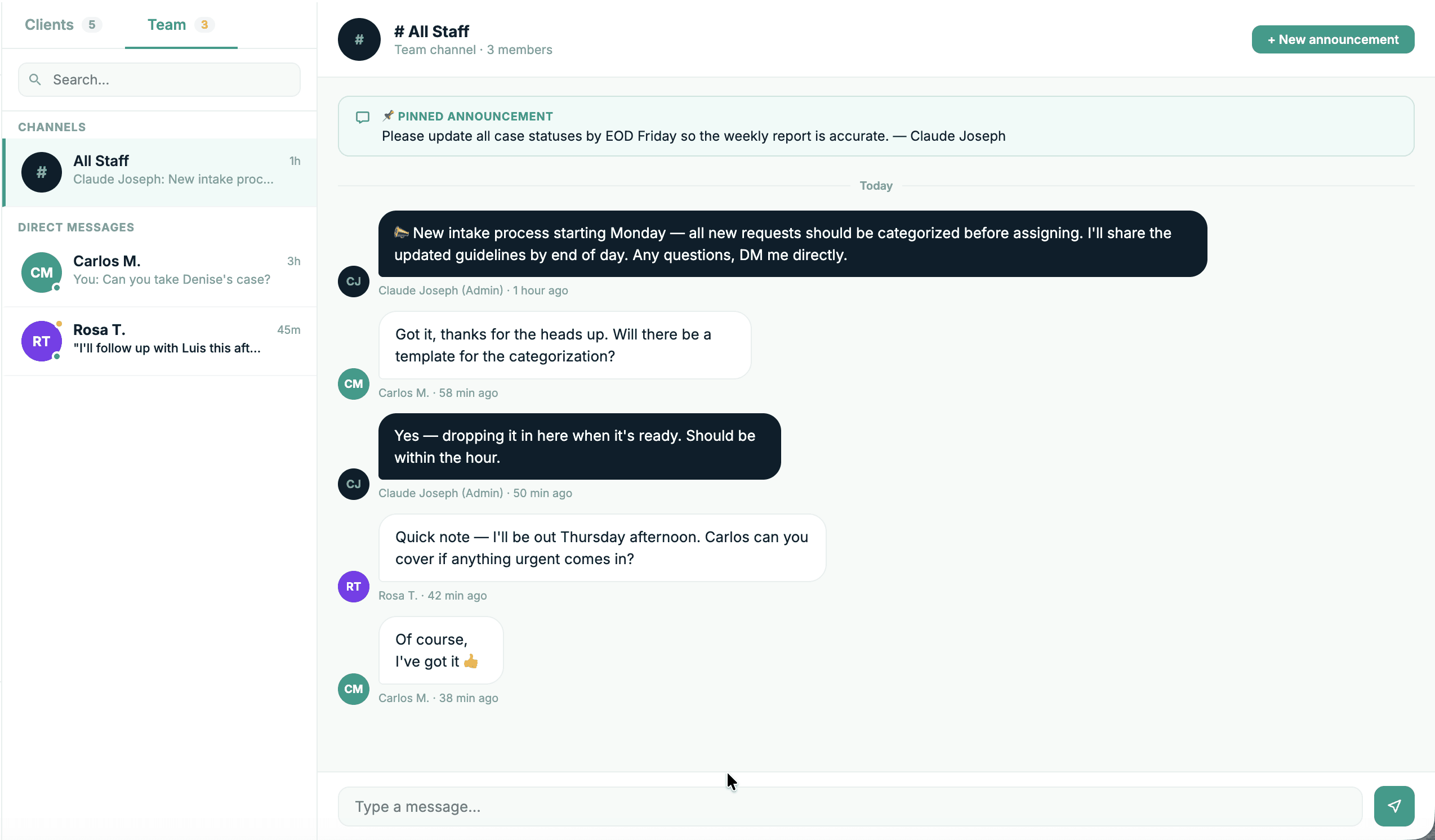
A direct CBO-to-client channel would have introduced a parallel communication track that confused clients about who their point of contact was and eroded caseworker accountability. If the admin can message clients directly, whose relationship is it? The messages page became an oversight view instead — all staff conversations visible org-wide, caseworker name labeled on each thread, no compose button. A persistent banner in every open conversation reads: "You're viewing this conversation as an admin. Messages are sent by the assigned caseworker." The design enforces the permission model.
The second discovery was that there was no internal communication layer at all. No broadcast channel, no way for caseworkers to coordinate, no direct messaging between staff. A single inbox would have mixed those contexts and their conflicting permissions — a caseworker replying to a broadcast they thought was a client message is a real failure mode. Messages became two tabs: Clients for the oversight view, Team for an All Staff channel, pinned announcements, and direct messaging. Two different jobs. Two different surfaces. Same screen.
This is the section of the product where the most consequential design decisions lived — and where going the obvious route would have created problems that looked like UX issues but were actually product architecture failures.


The Business Case
CBOs live and die by grant cycles. Every funding application requires impact data — cases resolved, response times, service categories, borough coverage. The standard way to produce that data is a manual compilation at the end of a cycle, pulling from spreadsheets, email threads, and memory. It's slow, it's error-prone, and it pulls staff time away from the actual work of serving clients.
HealthPowr tracks that data as a byproduct of normal platform use. A caseworker closes a case — the resolution rate updates. A request goes 48 hours without a response — the urgency flag triggers and the average response time reflects it. By the time New Youth Leaders in Fort Greene applies for their next grant, the numbers are already there. Exported in two clicks. No end-of-cycle scramble. That's not a reporting feature. That's a meaningful reduction in administrative burden for organizations that are already under-resourced. The founder named it as a core value proposition from day one, and it shaped the architecture of the admin system from the beginning.
The same logic applies to the caseworker workload grid, the oversight messaging model, and the structured case status taxonomy. None of those are UX decisions. They're answers to operational problems that make community organizations less effective than they could be. The platform is useful not because it's well-designed, but because it was designed around how this work actually gets done.
The AI-assisted Workflow
Throughout this project I used an AI-assisted workflow not to generate undirected output, but to compress the distance between a decision and its consequence. I could frame a product problem, work through the logic, and have a high-fidelity interactive prototype to pressure-test in the same session. That speed changed what was possible to question. When iteration is cheap, you can afford to be more skeptical of your first answer.
The handoff artifacts reflect how that workflow matured across the project. Early sections shipped with just an HTML prototype — a working, clickable reference for visual and interaction intent. As the product grew more complex, the packages expanded. Prototypes plus TSX component files. Then prototypes, components, and everything the developer needed to build correctly without a back-and-forth: a hero background accent map with exact positions, sizes, opacities, color tokens, and CSS transforms for all 11 SVG accent elements. All 11 SVG files. A HeroExact.css file. A CBO dashboard screenshot as a visual reference. A detailed handoff markdown walking through implementation intent section by section.
That progression wasn't planned. It was a response to friction — places where the prototype alone left too much open to interpretation. A pixel-perfect prototype without context is a prettier form of ambiguity. The handoff docs were the translation layer between design intent and engineering execution, written because no one else was going to write them.


What I'd Do Differently
The discovery flow works. But the search experience was designed around an assumption I didn't have time to challenge: that listing organizations by category and borough was enough to help someone find the right one. It might not be. A community member searching for housing help in the Bronx could get twelve results with no meaningful way to distinguish between them — different capacity, different intake processes, different wait times, all presented the same way. A real recommendation layer, ranked by need specificity, current availability, and proximity, would have required earlier conversations about data that didn't exist yet. I defaulted to the structural solution instead of pushing on whether the structure was the right answer.
That's the decision I'd make differently. Not a resource constraint, a design assumption I let stand because the timeline made it easy to. Without the timeline pressure, user testing would have been the first thing I reached for. Sitting with real community members during a search session, watching where they hesitated or gave up.
What's Next ?
The pilot launch is the beginning of the real design process, not the end of it.
The first thing that needs pressure-testing is the discovery flow. The search experience was built around an assumption that category and borough were the right filters for someone trying to find help. Real usage data will either confirm that or surface something more useful. If community members are searching in ways the current structure doesn't anticipate, that's the first thing to redesign. That work starts with observation, not iteration.
The school coordinator portal is already in design: a fifth user type with its own permission scope, mental model, and job to be done. After that, the referral network layer: the ability for CBOs to refer clients directly to partner organizations within the platform, with a shared case record that follows the client across the handoff. Right now that handoff happens over email. It shouldn't.
Longer term, the recommendation engine is the most interesting design problem in the system. When the platform has real usage data — which orgs respond fastest, which have capacity, which serve specific need combinations well — the discovery flow stops being a filtered list and becomes something closer to a match. That's when the product starts doing something a spreadsheet genuinely cannot.