Handing our users the keys
Product Designer

Overview + Problem
HealthPowr connected underserved New Yorkers to housing, healthcare, food, and employment resources through verified community-based organizations.
The product worked. But the first thing users encountered wasn't any of that, it was a sign-up wall — create an account, verify your email — before seeing enough value to justify the commitment at all.
For someone navigating a housing crisis or a food emergency, uncertainty around a product's value = certain drop-off. I redesigned the flow to deliver value before asking for commitment.
The result: completion intent increased +153%.
Context
On paper, it seems like what you need. The salesman asks if you'd like to start the paperwork — but you hesitate. You haven't sat in it. You don't know how the car REALLY feels.
Now he hands you the keys. You pull out, feel the acceleration. You realize — hey, I really do like the way this car drives. The paperwork doesn't feel like a barrier anymore. It feels like the next logical step.
HealthPowr's original flow asked users to fill out the paperwork first. The redesign handed them the keys.



Research
No users. No analytics.
Just pattern recognition.


Airbridge's onboarding research puts it plainly: timing beats design. A simple paywall shown at the right moment outperforms a polished one shown too early — every time. The biggest conversion killer isn't copy or layout. It's showing the commitment ask before motivation peaks.

Researching hero design patterns, I came across an article called "Hero Images are Dead" by UX Planet. The most interestingly transferable alternative discussed was the "search-first" model. Opendoor was the clearest example — you type your address, you get an offer. The account comes later.
The logic is simple: let users experience the product's core value — in Opendoor's case, an instant home offer — before asking them to invest time or personal information. By the time the account creation step arrives, users already know it's worth it.

Design Process
Start their search first.
Sign-up form last.
Communicate with real community resources in minutes and get personalized
help — no cost, no pressure.
The first two headlines talked about the platform — its simplicity, its proximity. The third talked to the user.
"Support is out there" is calm. It validates what the user already suspects before they've seen a single result. It's not a product claim — it's a statement of fact that the platform then delivers on. "Let's find it together" makes HealthPowr a partner, not a directory. The burden shifts. The user isn't searching alone anymore.
The period after "out there" creates a beat. A moment of reassurance before the ask.

Accompanying the header and search cta needed to be a visual, a proactive one. I used that space to build a mental model of the product for the user.
With Claude I was able to rapidly design, prototype, and iterate on a looped, simplified animation of the product flow, layered on top of a labeled map design, as the flanking visual.
This approach does two things: it shows the product working, and it makes an abstract platform feel immediate and real.

Design Solution
1 — Landing Hero Redesign

2 — Services Bottom Sheet

3 — Account Creation Modal
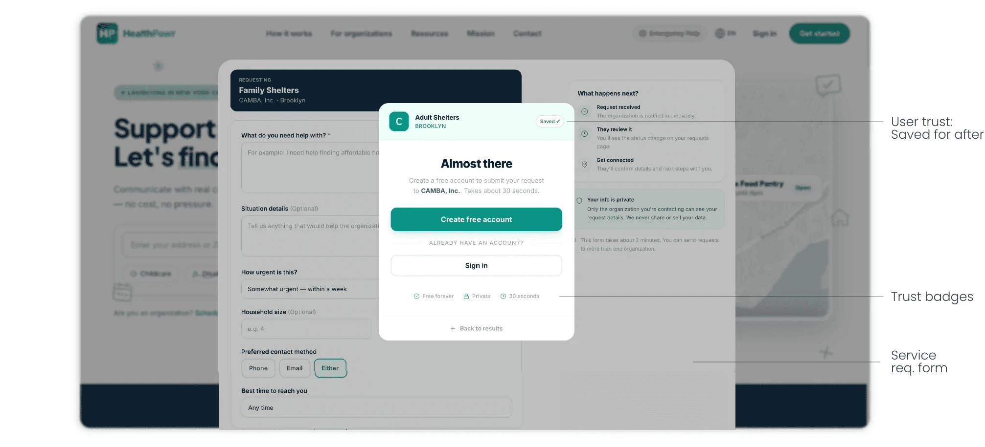
Testing
I ran Lyssna preference tests with 30 participants across two versions of the flow — original login wall, redesigned search-first — with one task: find food assistance near you in New York City. No hints. No guidance. Just the flow.

Let's close the deal.

Before
After
Results
Higher intent.
Clear preference.
Decisive findings.
"More interactive makes me want to engage with the site."
"I like to know my options first as I typically do not sign up for things I don't know exactly what I'm getting."
"This option gives me locations of places that would help with food assistance near me, so I would find the process more convenient immediately."
Lessons
On AI-assisted workflows
I used Claude throughout this project to compress the distance between a decision and its result. That speed changed what I was willing to question. The handoff artifacts also reflected how the workflow matured: starting with HTML prototypes, expanding into TSX components, then full build packages with accent maps, CSS files, and implementation docs.
On staying productive when blocked
When things slow down outside of your control, that means learning how to stay productive in the gaps. The instinct is to wait. The better move is to treat every blocked moment as a design opportunity, to go deeper on the thing already handed off, to spec the next surface before it's asked for.
On going wide
Five surfaces in three weeks means every surface gets attention and no surface gets enough. The lesson wasn't about working faster. It was about knowing which decisions deserved depth and which deserved a strong default, and making that call early.
Testimonials
POV: working with Donovan

Founder & CEO, HealthPowr
Mardochee Philippe
"Donovan was there from the very beginning of HealthPowr and helped shape and improve the UI design into what the platform is today. He has a real gift for translating a mission into something clean, accessible, and easy for anyone to understand exactly what a platform built for underserved families needs. I'm grateful for the work he put in early on, and I'd recommend him to anyone looking for a designer who genuinely cares about the product they're building."

Lead Developer
Jai Kumar
"Donovan's handoff docs and prototypes made it significantly easier to jump into the HealthPowr codebase. The landing flow prototype was detailed enough that I could match the exact design without back-and-forth, and the documentation gave clear context on the architecture decisions. It saved me a lot of guesswork and let me focus on building instead of figuring out intent."